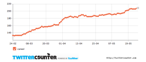
Analytical warning: Although humans are biased to (1) see patterns where there are none, and (2) infer positive things about ourselves from data like these, Twitter is still too young for this to be very meaningful. Why? Over time, most people will see their following increase as more and more people get onto twitter. That time and twitter world-wide usage are intertwined (or in statistical terms, these variables are autocorrelated) means that the upward slope of the line probably doesn’t reflect a real popularity increase, and it certainly doesn’t shed light on the degree of impact of what you tweet (people often follow others with hope of reciprocation (a norm promoted by Guy Kawasaki and others). Just because people “follow” you doesn’t mean they read what you tweet – especially since Twitter added lists as a standard feature.
Looking at my graph above, it looks like increasing status update volume leads to increased followership, but like I say, I may just be biased…. (I’m only human and I’d love to believe that I can control what people think and do with just 140 characters a day! But that inference doesn’t pass the sniff test.)
(Cynical capitalists’ warning: TwitterCounter also sells “featured twitter user” spots for a hefty sum! I can imagine this is pretty profitable – if you’re a twitter or self-promotion addict, you’d be tempted to pay to “add followers” as they put it every time you saw your follower numbers rise OR fall.)

